In this post, we would like to inform you that color coordination site 3 allows you to choose a harmonious color for those who have difficulties in choosing a color.
1. color.adobe.com
포토샵, 일러스트레이터 등으로 유명한 adobe사의 사이트입니다.
You can see which colors are used by designers by searching [Search]> [Theme] in order of "popularity" and "number of use". Once you have chosen the color you want to use, you can take a screenshot and use PowerPoint's "eyedropper" feature to select colors for shapes or text in your document.
2. plaetton.com
There is also this feature in adobe which I introduced above, but it is a site that finds similar and complementary colors. Personally, this site seems a little more comfortable to use. Hue value, brightness, contrast value can also be adjusted.
We also provide sample sites in selected colors, so you can see the overall feeling.
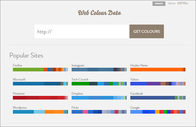
3. webcoloredate.com
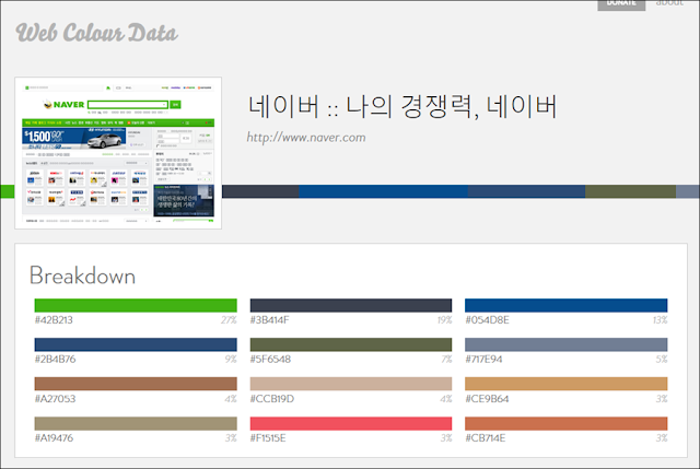
It is a site that automatically extracts the color of a website. Type url to extract the color used on the site.
The good thing about this site is,
If you write a proposal, you can use the company's ci color in the PowerPoint document as it is.
Usually, corporate homepages use colors that match the company's identity. Therefore, it is easy to create a PowerPoint document that matches the corporate identity by simply extracting the color of the homepage.
How do you use PowerPoint to select a color from a coloring site? Please check the link above.
Capture screenshots and use PowerPoint's "eyedropper" function.
Capture screenshots and use PowerPoint's "eyedropper" function.


EmoticonEmoticon