레이블이 color인 게시물을 표시합니다. 모든 게시물 표시

Free Three sites to help you choose colors at PowerPoint


One of the hardest things about creating a PowerPoint document is choosing a color. It is true that it is difficult for professional designers, general college students, and office workers to choose color and create a PowerPoint document.

In this post, we would like to inform you that color coordination site 3 allows you to choose a harmonious color for those who have difficulties in choosing a color.

1. color.adobe.com


포토샵, 일러스트레이터 등으로 유명한 adobe사의 사이트입니다.


You can see which colors are used by designers by searching [Search]> [Theme] in order of "popularity" and "number of use". Once you have chosen the color you want to use, you can take a screenshot and use PowerPoint's "eyedropper" feature to select colors for shapes or text in your document.


2. plaetton.com


There is also this feature in adobe which I introduced above, but it is a site that finds similar and complementary colors. Personally, this site seems a little more comfortable to use. Hue value, brightness, contrast value can also be adjusted.


We also provide sample sites in selected colors, so you can see the overall feeling.

3. webcoloredate.com


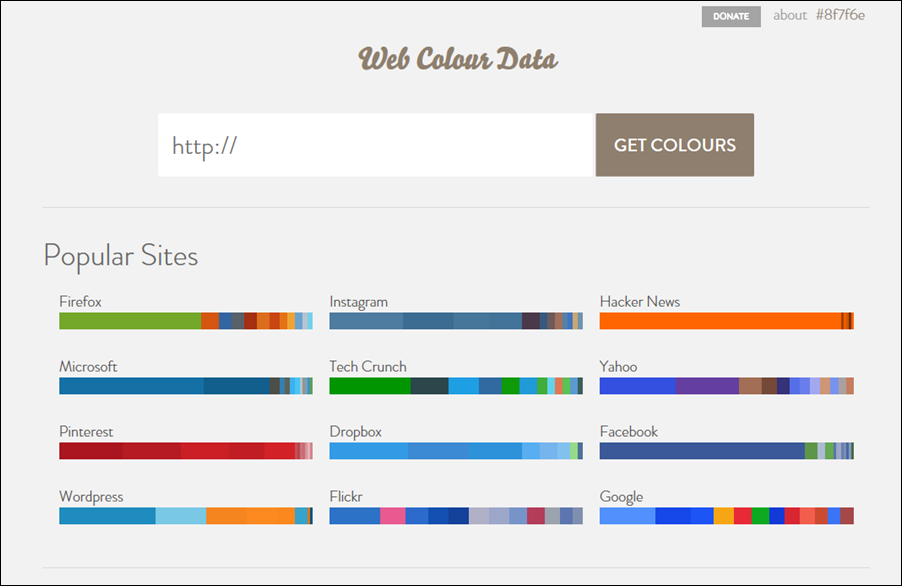
It is a site that automatically extracts the color of a website. Type url to extract the color used on the site.


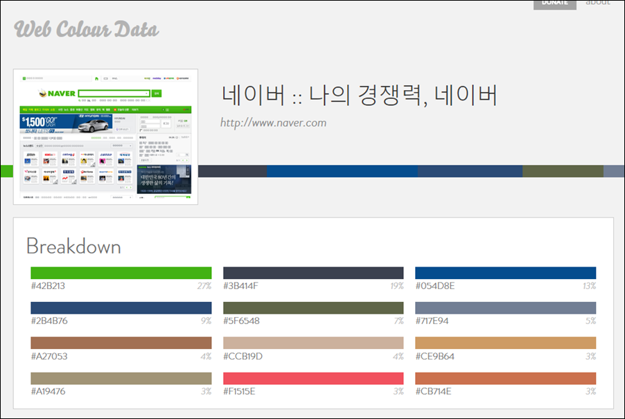
The good thing about this site is,
If you write a proposal, you can use the company's ci color in the PowerPoint document as it is.
Usually, corporate homepages use colors that match the company's identity. Therefore, it is easy to create a PowerPoint document that matches the corporate identity by simply extracting the color of the homepage.


How do you use PowerPoint to select a color from a coloring site? Please check the link above.
Capture screenshots and use PowerPoint's "eyedropper" function.

How to use the eyedropper feature in powerpoint for windows


When I create a PowerPoint document, I always have a problem. That's right,

Color choice!


Why do I make PowerPoint? Can not you use pretty colors like designer? I want to use a prominent complementary color, but I must have learned color ... and so on.

Color selection is always a hard work for document authors.


The PowerPoint theme does not mean that the basic colors are not pretty. There is no reason for developers to choose a default color. The reason is consideration for color medicine / color blindness. It is also used to distinguish when printing in black and white.

But I still have the desire to make my PowerPoint document better.

There is a power point function that can solve our troubles at this time.

It is an eyedropper feature.


This is a function that allows you to select the colors of other designers' colors, the colors used in other documents, and the colors of your PowerPoint documents.


This is a template I uploaded before. Yellow color is the main color, but only gray and yellow colors are used. However, some people say that color is bored.

I would like to convert it to a more prominent color by downloading it. Next, I will post about the color-related site, but I will let you know one in this posting.


Originally, it is a coloring site that designers use, but it is also quite helpful to those who do PowerPoint.


It is a site that finds adjoining colors together with complementary colors through various options. Capture the screen and paste it into your slide


We will use the "eyedropper" function to change the color of the shape.
Select the shape you want to change the color of, then select [Fill Shape]> <[Spoiler]> and then drag the eyedropper to the desired color and click. This will change to the desired color.


I tried changing the color to yellow. It's not bad.

If you have difficulty choosing a color, please remember the "eyedropper" function. Benchmarking is not only bad. ^^